Dubai Airport
Creating an incredible "Journey Genie" for passengers to engage and interact digitally with the Dubai Airport
2012 @ StartJG

In 2012, Dubai International, one of the busiest international airports, aimed to overhaul their corporate website to increase online traffic. The existing website was a traditional information site with mixed content catering to different target audiences. As a UX freelancer, I was part of the StartJG Hong Kong team tasked with redesigning the online experience for Dubai Airport.
Challenge
For gaining the online traffic, our target audiences should be the general public and we should create a motivation for them to visit the website. The IA of the previous website have too much corporate information which were unrelated to passengers.
Our high-level goals were to:
Separate IA for different types of audiences: passengers and corporate partners
Find out the major need of the passengers from the website
Create a feature for innovative engagement

My Role
It is my pleasure to have joined the team, and I'm thankful to the senior UX designer, Stephen Pills, for giving me the opportunity to design the information architecture and strategic features of the website in its initial stages from November 2012 to December 2012. I collaborated with a UI designer, a front-end developer, and a technical manager during this period.
I handed over the project to Stephen during the detailed visual design phases.
The responsive website and the app were launched globally in 2014.
Research Goal and Methodology
To boost online traffic, our target audience was the general public, and our aim was to inspire them to visit the website. The previous website suffered from an information architecture overloaded with corporate content unrelated to passengers.
Our high-level goals included:
1. Segmenting the information architecture to cater to different audience types: passengers and corporate partners.
2. Identifying the primary needs of passengers using the website.
3. Implementing innovative engagement features to enhance the user experience.
Initial Research
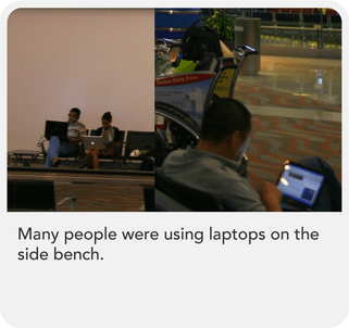
Before commencing the project, I had the advantage of having stayed at Dubai Airport, during which I captured over 1000 photographs depicting passenger behaviors, signage, and store layouts. These images served as invaluable assets for my analysis.
Image Content Reviews and Analysis:
I investigated the most common actions taken by users during their stay at the airport.
I examined the types of shops that were most prevalent.
I assessed the types of signage that were displayed most frequently at the airport.
Based on the above findings, I formulated hypotheses to guide further research and design decisions.
Advanced Research
I conducted in-depth exploration of various travel forums to pinpoint the most frequently discussed topics and gather insights for the project.
What I had found?
There are what I have observed at Dubai Airport
According to the flight information from the airport, the shortest transit time could be just 45mins, while the longest transit time could be 3 days. If the passenger needs to transit within 45mins, it would be a nightmare for the passengers. They will be full of anxiety.
Also, I had reviewed the comments on different travel forum.

Impact
The new website was launched in 2014. According to the year report of 2014, 600,000 people visit a month to http://www.dubaiairports.ae/ in 2015
Solution
I remember when I was staying at the airport, I observed many people preferred to wait near the departure gate for a few hours. I understood why they stayed there. They might not know what could be done during transit, or didn’t know the nearest restaurant, or public rest place, or they just didn’t want to spend money.All of these are about way-finding and journey planning. If I could design a tool for them to plan their airport journey before the trip and the site was easy to find staying tips, it could enhance their experience at the airport. This was the design direction of my work.
What is Journey Genie?
Journey Genie is a fingertip feature that enables passengers to customise the information they receive by inputting their specific flight. It also had an SMS feature to remind the passenger about the gate closing time.The website mirrors the whole passenger’s journey and the information architecture allows our passengers to better navigate the information of airports and its facilities before they arrive.
How to get there
I have written down the whole travel journey and find the touch point opportunity.

The touch point would be at the travel forum; or online ticketing app; or when the passengers would like to check about the tips of security and regulations, they would visit the website. Since the passengers would visit the website at the early stage of the journey, so I should put the journey planner (Journey Genie) at the obvious position in the site, so that I could keep the passenger come back to the site.
The Journey Genie should tell the passenger:
What should be prepared before their flight
What would happened after arrival
Where they could go for rest or dining if they need to connecting flight
What kinds of facilities could be used when they are staying at the airport
I designed the IA according the passenger’s journey in reality and separated the passenger information from corporate information.

Initial design of Journey Genie


After several discussion with Dubai Airport, Stephen and I agreed to remove the time display, because the airport working team could not guaranteed the security checking time which will make passengers disappointed easily. SMS notification was kept at the latest version of the website.


